Table of Contents
The Key differentiator of any successful digital campaign is a landing page that effectively attracts visitors, turning them into customers at the decisive moment.
The iPhone 15 Pro landing page keeps everything simple yet very effective. Just with the help of a powerful image, a crisp value statement, and a focus on the fabulous features of the product page, it is making sales without any distractions from the layout and direct call-to-action. Skincare brand Plenaire is highly effective in narrating the story of the product through their choice of harmonious color palette, customer quotes, and convincing product features. On the other hand, Zoho Bookings and Tootbus London are leveraging the use of user-friendly navigation, always visible call-to-actions, and engaging content to encourage more signups or ticket purchases.
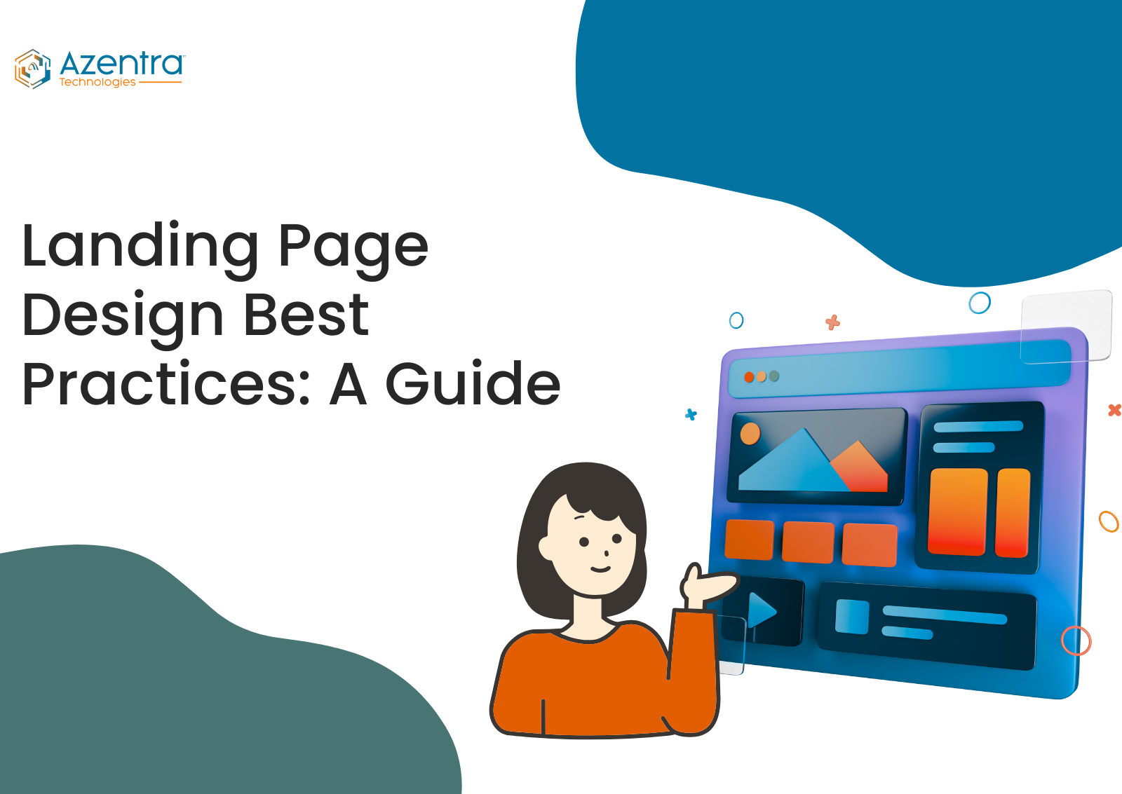
Below, the Landing Page Design Best Practices guide will provide you with the main ideas of creating efficient landing pages, starting from the structure and moving to the copy, visuals, and user experience.

What Makes a Great Landing Page?
A successful landing page is a visually appealing interface, and a focused tool aimed at increasing conversions by providing straightforward, concise value and helping users to perform a specific action. Top landing pages in the UK adhere to fundamental best practices that major brands implement to elevate their outcomes:
- Clear Value Proposition: The benefits or value of a product/service should be communicated immediately. UK brands often use short headlines and punchy messaging as a way of expressing to users what they will get from a product/service.
- Compelling CTA (Call to Action): The most prominent element of the page should be a CTA, an element that is effortless to find and made of action-oriented words. Many of the best-performing pages seem to utilize contrasting colours for their CTA and also provide clear instructions (e.g., “Get My Free Quote” or “Book Now”).
Minimal Distractions: Removing unnecessary navigation and clearing clutter should prevent website visitors from being distracted and not converting. Designers can remove the menu bars and, at the same time, keep the elements spaced with lots of white space. - Fast, Mobile-First Design: In order to be responsive and speed-optimized, the layouts have to be mobile-first, especially when 83% of the landing page visits are done through mobile devices in the UK.
- Social Proof: Social proof can be counted in the testimonials, the reviews, or the client logos; these are some of the ways through which landing pages quickly gain the trust of potential customers.
- Engaging Visuals: The use of high-quality graphics and videos to support the message and to attract people, especially when the products or services are complex or new, is implied.
- Concise Forms: Request only the data you really need; shorter forms are more likely to be filled in by users.
The Ultimate Guide to Proven Landing Page Best Practices
Landing page best practices first and foremost revolve around using them as the basis for your initial design. Your page is live, you should perform different tests, analyze the results, and, through the behavior of your audience, figure out the correct version that really leads to the highest conversions.

Align Your Landing Page Messaging with Your Ads:
The primary purpose of using dedicated landing pages is to help in fulfilling the promise made in your ads. Your headline, copy, and design should definitely be in line with what the users clicked on. It helps them to verify that they have indeed made the right choice.
As an example, the landing page of your ad should focus on promoting retirement communities rather than redirecting visitors to luxury condos. When the message is mismatched, people get confused, and hence, the bounce rates go up. If you have several variations of ads, then you can make the respective landing pages or use them to keep the messages consistent.
Craft a Clear and Compelling Headline

The headline of your website is the primary thing that people notice. It must convey your offer in a clear and quick manner. Make use of brief expressions that appeal to your target audience and emphasize the leading advantage of your product or service.
For Example: Boost Your Online Sales by 30% with Expert Digital Marketing Services!
- The principal advantage is communicated in a very clear and quick way (online sales increased by 30%)
- The text is very concise, and the words used are very actionable.
- The message is being addressed to the target audience in the UK in a straightforward manner (business owners and marketers)
- Such a significant outcome being emphasized makes the proposal very attractive.
Demonstrate Real-World Use of Your Product or Service
What could be more efficient and faster than simply showing how your offer or product works without involving long, tedious, and tiresome explanations? Hence, to communicate how a product or service operates, you are allowed to take advantage of such attention-grabbing visuals as photos, explainer animations, or demo videos. The main visual of your landing page is the ideal place to establish this strong influence for the first time.
Eliminate Unnecessary Distractions
A working landing page makes its visitors stay focused on one single objective: conversion. It is advisable not to add elements that divert the attention of your visitors, for instance, navigation menus, extra calls-to-action, or links to other pages (which may include your homepage). The aim here is to take the users to complete the action you want them to do in a way that is very easy and without giving them a reason to click away. Using a neat, single-focus design is your way of ensuring that your message is loud and clear and your conversion rate is still high.
Optimise for Mobile:

Since the majority of users in the UK are browsing through their mobile devices, it is essential to have a landing page that is responsive. The CTA buttons, pictures, and forms of your website should look good and be simple to click on or tap if someone is using a small screen. Pages that load quickly are significant for user experience, and they also lower the chances of visitors leaving the site immediately.
Conclusion:
Creating an effective landing page that converts well is artistic and scientific. If you adhere to the tried-and-tested best practices, such as having a clear message, using eye-catching visuals, having a focused CTA, and conducting continuous testing, then you will be able to make casual visitors your loyal customers. The landing pages that work best, in fact, are those that develop over time through genuine user feedback and optimization based on data.
In case you are aiming at creating conversion-focused websites and landing pages, which can show the results clearly, AzentraTech is the right place to get a professional website development service that suits your brand goals. Reach out to their specialists and get the perfect online experience for your business growth and customer engagement.

Azentra Technologies
Your Partner in Digital Transformation
Azentra Technologies specializes in custom web design & software development. We create user-friendly, high-performance mobile & web applications, cloud services, and digital strategy consulting. Our expert team delivers scalable solutions that drive growth and efficiency for businesses of all sizes. Partner with us to turn your vision into a powerful digital reality. Get Started Today!
Categories
- Cybersecurity (1)
- Digital Marketing (9)
- Graphic Design (1)
- SEO (3)
- Social Media Marketing (1)
- Software Development (3)
- uncategorized (17)
- Web Design (3)
- Web Development (3)


